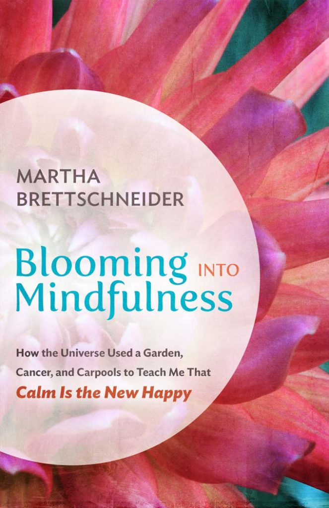
I’m thrilled to be able to unveil my book cover for Blooming into Mindfulness: How the Universe Used a Garden, Cancer, and Carpools to Teach Me That Calm Is the New Happy.
What do you think?
My Facebook friends will be saying right now, “Wait a minute…that’s not the cover you posted several weeks ago asking for input. Where did that one go?”
Yes, I had put a cover up on my personal Facebook page with a request for comments. It was a bright, bold cover that was the result of many months of back and forth with a designer I had contacted back in January.
There was a big debate among my friends about how the title was laid out, and I asked the designer to revise the cover based on those comments.
The designer wasn’t fully happy with the finished product; I wasn’t fully happy with the finished product. I was worn down, though, and the designer was out of ideas, so I thought it would be good enough.
But when I sent it to the marketing person with whom I’ve been working and to the folks doing the interior layout, I got the same response: “It looks self-published.”
I had prioritized readability on a thumbnail image and hoped to have one of my photos incorporated into the design. The first cover met those criteria, but any version larger than a thumbnail made a heavy, clunky impression. The color scheme was also a little risky for a full-sized hard copy book.
And though that first design did technically use a photograph I had taken myself (the font is comprised of dahlias at a farmer’s market), it didn’t reflect the style and essence of my garden photography, which has become an integral aspect of my mindfulness practice.
I am a person who connects deeply with a beautiful book in my hands. Having worked so hard on the content of my manuscript, it would kill me to be disappointed with the cover once I was holding the finished product.
In fact, having final say over the cover design was one of the many reasons I decided at the outset to self-publish my book. I liked the idea of “artisinal” book publishing described by Guy Kawasaki in APE: Author, Publisher, Entrepreneur (affiliate). Having embraced my creative side after being trapped for so many years as an economist, I loved the idea of being able to craft each and every aspect of the my book.
I am well suited to being an indie author and publisher. I like making decisions. I’m detail-oriented. I have enjoyed hand-picking the team helping me along the way. The business side of the process has been interesting rather than intimidating. And I’m even looking forward to this next phase of marketing, understanding the uphill battle for indies when it comes to distribution and discoverability.
But that first cover created a knot in my stomach. As soon as the marketing expert said, “It looks self-published,” I knew she was right. The interior designer’s seconding of that opinion reconfirmed it.
It’s one thing to want to have creative control, but another thing to recognize when to respect the opinions of experienced professionals in the field.
Mindfulness practice has taught me to pay very close attention to signals from my body. My head might be telling me something like, “You’ve spent enough time on the cover, and plenty of people liked it. You’ve already showed it to them so you’ll look stupid and indecisive if you change course. Plus, you will have wasted their time since you already asked for their opinion on the first one.”
But that knot in my stomach told me I wouldn’t be happy with the cover. That knot in my stomach told me that I would regret not being brave enough to hire a new designer.
My body never lies. If what my body is telling me is out of alignment with what my head is telling me, my body’s opinion is always the one to be trusted. As soon as I let go of the old design, I was flooded with a deep sense of relief and an overall lightness of being. There was no question that I had made the right decision.
The new team, 1106 Design based in Phoenix, Arizona, did exactly what I had hoped they could do. The designer went to my website and, without any guidance from me, pulled three images from my photography gallery and created three very different cover concepts.
One was a classic mindfulness-themed cover, serene and contemplative. One was playful, busy, and bright, but a little too girlie for me. The third one is the one you see here, with a few tweaks added to make the “calm is the new happy” tagline of the subtitle stand out on a thumbnail.
It was important to me that the cover be appealing to a younger demographic (young moms, in particular), since I wasted so many years when my kids were small just waiting for time to pass rather than being present with my life in real time. I also wanted it to reflect my writing style, which is more energetic than what you’ll usually find in books about mindfulness.
And though my friends who already understood the benefits of mindfulness preferred the most serene cover, younger people thought it looked too serious, if not a little dull. With so little time to read books, one young mother told me, she wouldn’t choose one that looked serious, heavy, or boring.
So you tell me…does this book cover grab your attention and peak your interest? I do hope so! Let me know what you think in the comments!
You can read the full introduction to Blooming into Mindfulness here!
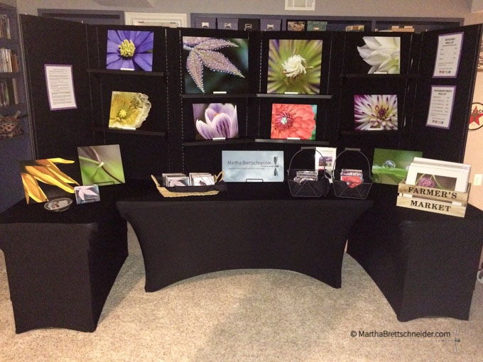
One last housekeeping note: If you’re in the Washington, DC, area and are free this Saturday, November 14, come visit me at Robinson Secondary School’s “Marketplace” indoor holiday market, 10 am – 4 pm, 5035 Sideburn Rd, Fairfax. My notecards are perfect hostess gifts and my signature metal prints are suited for both indoor and outdoor living spaces. Hope to see you there! If you can’t make the show, you can always place orders on my website!
If you enjoyed this piece and are not yet a subscriber, sign up for my list today and receive my free ebook Six Playfully Mindful Strategies to Beat Procrastination and Boost Productivity.
And if you know someone else who might benefit from a little mindfulness, please spread the word! Social media likes and shares are always appreciated as well.
From time to time I use Amazon affiliate links in my posts. Sales via these links provide a small commission, but I only include affiliates that I have tested out myself and believe will benefit my readers. Each will be noted in the post for full disclosure.
Finally, if you find typos anywhere on my site, I’d be grateful if you let me know. I hate typos! Contact me so that I can correct the error. Thank you!


